Design & Art Portfolio
Case Study: NCM Transit
In the spring of 2009, Opportunity Link approached me about doing some freelance design work for them, on a new rural/city public transit system they were developing for the Montana Hi-Line. They wanted me to help with name selection, logo design, marketing, web design, the whole bundle.
They had announced a contest to name the new transit system, with community members offering suggestions. They gave me a list of about two dozen proposed names, ranging from the generic ("Town to Town Taxi") to the bizzare ("Galloping Gert"), and asked me to make suggestsions about the most affective branding names. I voiced my opinion in favor of either "Hi-Line Transit" or "Great Northern Transit," both being regionally and service specific, easy to remember, and easy to incorporate into a logo design. After some discussion among the committee members, it was decided that "North Central Montana Transit," although long, was the most appropriate name. I suggested that the name be shortened to NCM Transit for most purposes, including registering the web domain, and they agreed.
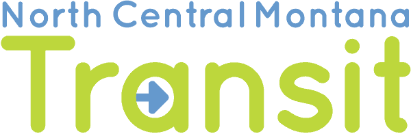
From there I started work on a logo design, aiming for one that was simple, distinct, and friendly, while not being too cute or folksey. Montana logos with bear paws and mountain ranges and moose prints are a dime a dozen, so I wanted a more modern, professional looking design, without being intimidating. I went through a few different iterations, but the basic concept popped up pretty early in the process: bright, friendly colors, a rounded, open sans-serif typeface, a simple symbol integrated into the type. After a couple of committee presentations, the final logo was agreed on.
The NCM Transit website design flowed from the logo design: crisp, bright, and uncluttered. The website was built with older computers and slow internet connections in mind, so the HTML and CSS was carefully coded to degrade gracefully for browsers as old as IE 5 or Netscape 4, while still integrating some modern code like rounded CSS2 borders.
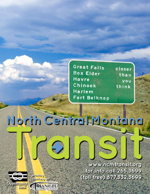 Another design early in the project was a promotional teaser poster, distributed a month prior to the beginning of bus service. North Central Montana has never had a transit system, so public awareness would be a challenge. The poster was intended to convey the idea of a transit system making travel between our communities easier. People that don't live in Montana often don't understand the scales involved out here; it's about three hours highway driving from one end of the transit service area to the other, an impossible distance for individuals without reliable private transportation.
As the Transit system began operations and people started using it, they started to understand the value of the service. NCM Transit originally expected to serve about 200 people a month in its first year; by October, it was carrying 500 people a week.
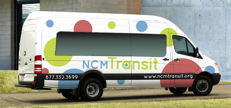
During 2009, NCM Transit leased busses and transit vans from Glacier National Park. In 2010, they'll be recieving a set of Sprinter vans of their own, courtesy of the National Recovery Act. I've been asked for some proposals for branding and design for the vans' paint jobs. My proposal?
Will they go for it? This page will be updated when we find out!
This portfolio entry is still under construction, more to come!
♻